

7 Mistakes You're Making with Your Storefront Signs in Troy, NY (And How to Fix Them)
Did you know that nearly 76% of consumers say they have entered a store or business they had never visited before based purely on its signs? In a competitive landscape like the Capital Region: spanning from the historic streets of Troy to the bustling corridors of Albany and Schenectady: your storefront sign is often the very first "handshake" you have with a potential customer. If that sign is confusing, hard to read, or poorly maintained, you aren't just losing a lead; you are actively handing your business to the competitor down the street.
As a business owner, you have a million things on your plate. It’s easy to overlook the nuances of graphic design and local ordinances, but ignoring the quality of your signage is a gamble you can't afford to take. At Vital Sign & Graphics, we’ve seen it all. We know what works for a shop in Clifton Park and what fails on a busy corner in Schenectady.
Here are the seven most common mistakes we see businesses making with their storefront signs in Troy, NY, and exactly how you can fix them to start driving more foot traffic today.
1. The "Invisible" Sign: Poor Size and Placement
One of the most frequent errors is choosing a sign that simply doesn't fit the environment. You might have a beautiful logo, but if it’s too small to be read by a driver cruising down Hoosick Street, it might as well not be there at all. Visibility is about more than just height; it’s about the "viewing envelope."
A general rule of thumb used in the industry is the 10-to-1 rule: for every 10 feet of viewing distance, your lettering should be at least one inch tall. If your customers are viewing your sign from 100 feet away, those letters need to be at least 10 inches tall to be legible. Furthermore, placement is key. If a tree, a utility pole, or a neighbor’s awning blocks your sign from certain angles, you are missing out on a massive chunk of your audience.
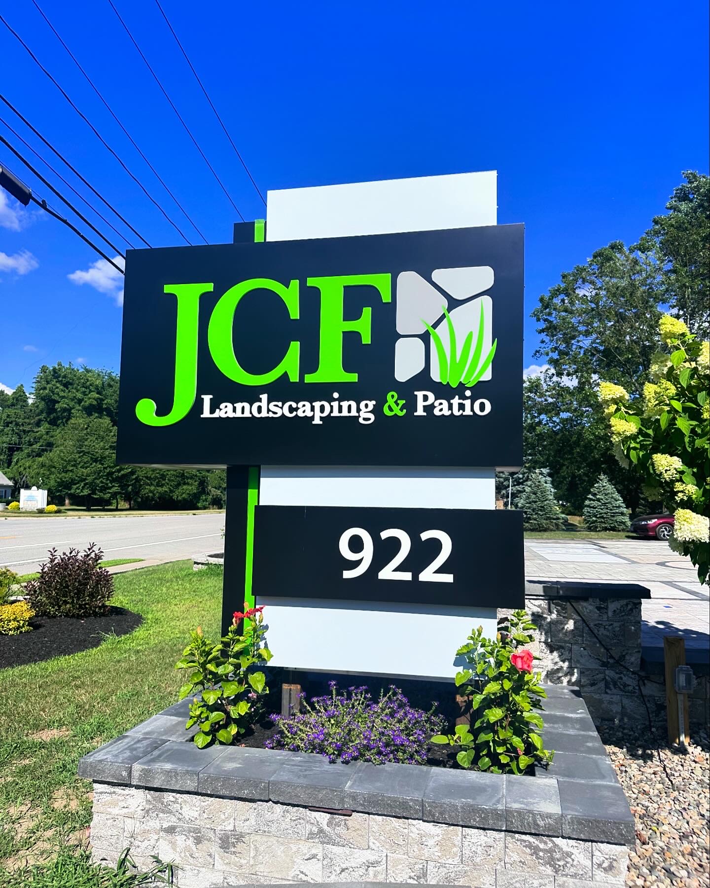
The Fix: Conduct a "drive-by" test. Approach your business from both directions at the speed of traffic. If you can't read your sign clearly within three seconds, it’s time for an upgrade. Consider a monument sign if your building is set back from the road, as these are positioned closer to the eye level of drivers.
2. Using Overly Complex or "Fancy" Fonts
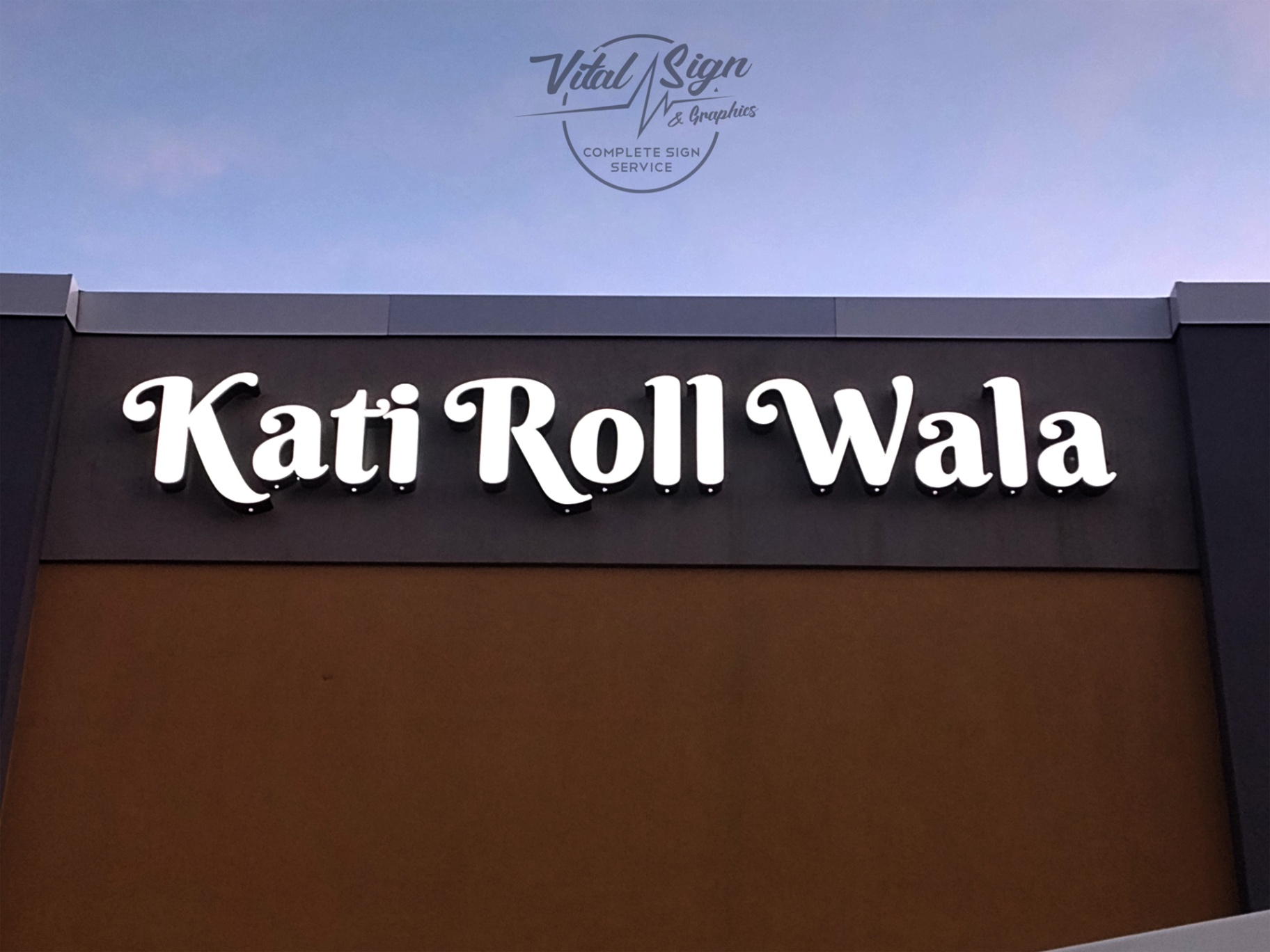
We get it: you want your brand to look sophisticated. However, there is a massive difference between a font that looks good on a business card and one that works on a 20-foot storefront. Script fonts, thin serifs, and overly decorative typefaces often blur together when viewed from a distance or in low light.
When searching for a "vinyl sign shop near me," many business owners prioritize style over substance. In the world of signage, legibility is king. If a potential customer has to squint to understand what you do, they will simply keep moving. Your sign needs to be a clear, bold declaration of your presence.
The Fix: Stick to clean, sans-serif fonts or bold slab serifs for your primary business name. Save the artistic flourishes for your interior graphics or smaller window decals where customers are standing just a few feet away.
3. Low-Contrast Color Combinations
You might love the look of a light gray logo on a white background, but in the bright sun of an Albany afternoon or the gray slush of a Troy winter, that sign will disappear. Contrast is the secret sauce of effective signage. Without a sharp distinction between the foreground and background, your message gets lost in the visual noise of the street.
High-contrast pairings, like white text on a dark blue background or black text on a yellow background, are proven to be the easiest for the human eye to process quickly. This is especially important for businesses in the Capital Region where weather conditions can often reduce visibility.
The Fix: Always aim for at least a 70% contrast brightness between your text and the background. If your brand colors are low-contrast, consider adding a bold outline or a "drop shadow" to the letters to help them pop against the building facade.
4. Information Overload (TMI)
Your storefront sign is a beacon, not a brochure. A common mistake we see in Schenectady and Troy is businesses trying to list every single service they offer on one main sign. When you cram a phone number, a website, a list of five services, and a slogan onto a single board, the human brain stops reading.
Drivers and pedestrians have about 2.5 to 3 seconds to absorb your sign. If there is too much text, they won't absorb anything. You want them to remember your name and what you do: period.
The Fix: Keep your main sign simple. Use your business name and perhaps one high-level descriptor (e.g., "Pizzeria" or "Legal Services"). Use your window graphics or secondary signs to list your hours, phone number, and specific services.

5. The "Dark Mode" Fail: Inadequate Lighting
In Upstate New York, it gets dark early for a large portion of the year. If your sign isn't properly illuminated, you are effectively invisible from 4:30 PM onwards in the winter months. Many businesses rely on "gooseneck" lamps that cast uneven shadows or, worse, have no lighting at all.
Modern lighted signs are an excellent way to ensure your brand works for you 24/7. Whether it's internally lit cabinet signs or sophisticated channel letters, lighting provides a professional glow that signals your business is open, active, and successful.
The Fix: Upgrade to LED-illuminated signage. LEDs are energy-efficient, require less maintenance than traditional neon or fluorescent bulbs, and provide a crisp, even light that makes your brand stand out on the darkest Troy nights.
6. Inconsistent Branding Across the Board
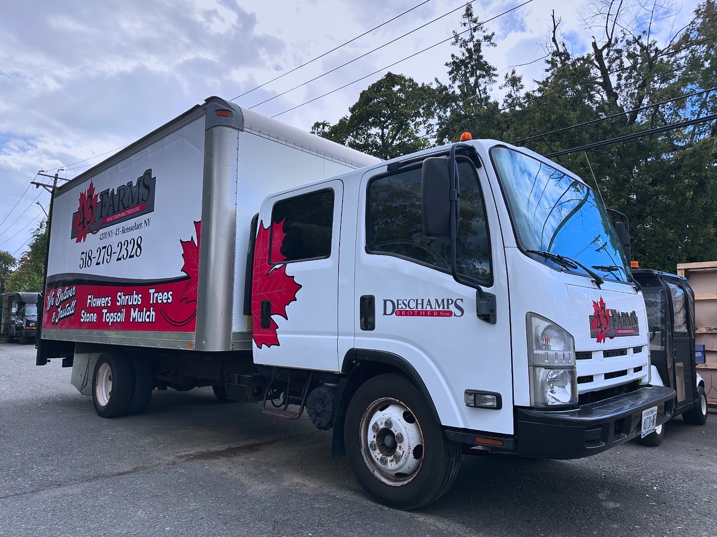
Your storefront sign shouldn't exist in a vacuum. A major mistake is having a beautiful, modern sign on your shop in Clifton Park, but having a completely different logo or color scheme on your delivery vans. This creates "brand friction." Customers should be able to recognize your business instantly, whether they are seeing your truck on I-87 or walking past your front door.
If you are using a vinyl sign shop near me for your store, make sure they also handle your vehicle graphics. Consistency builds trust. When a customer sees the same professional branding on your storefront, your website, and your service fleet, it reinforces the idea that you are an established, reliable expert.
The Fix: Create a simple brand style guide. Ensure that the exact same colors, fonts, and logo versions are used for your car wraps and your exterior building signs. As you can see, a unified look makes your small business feel like a major player.
7. Neglecting Basic Maintenance
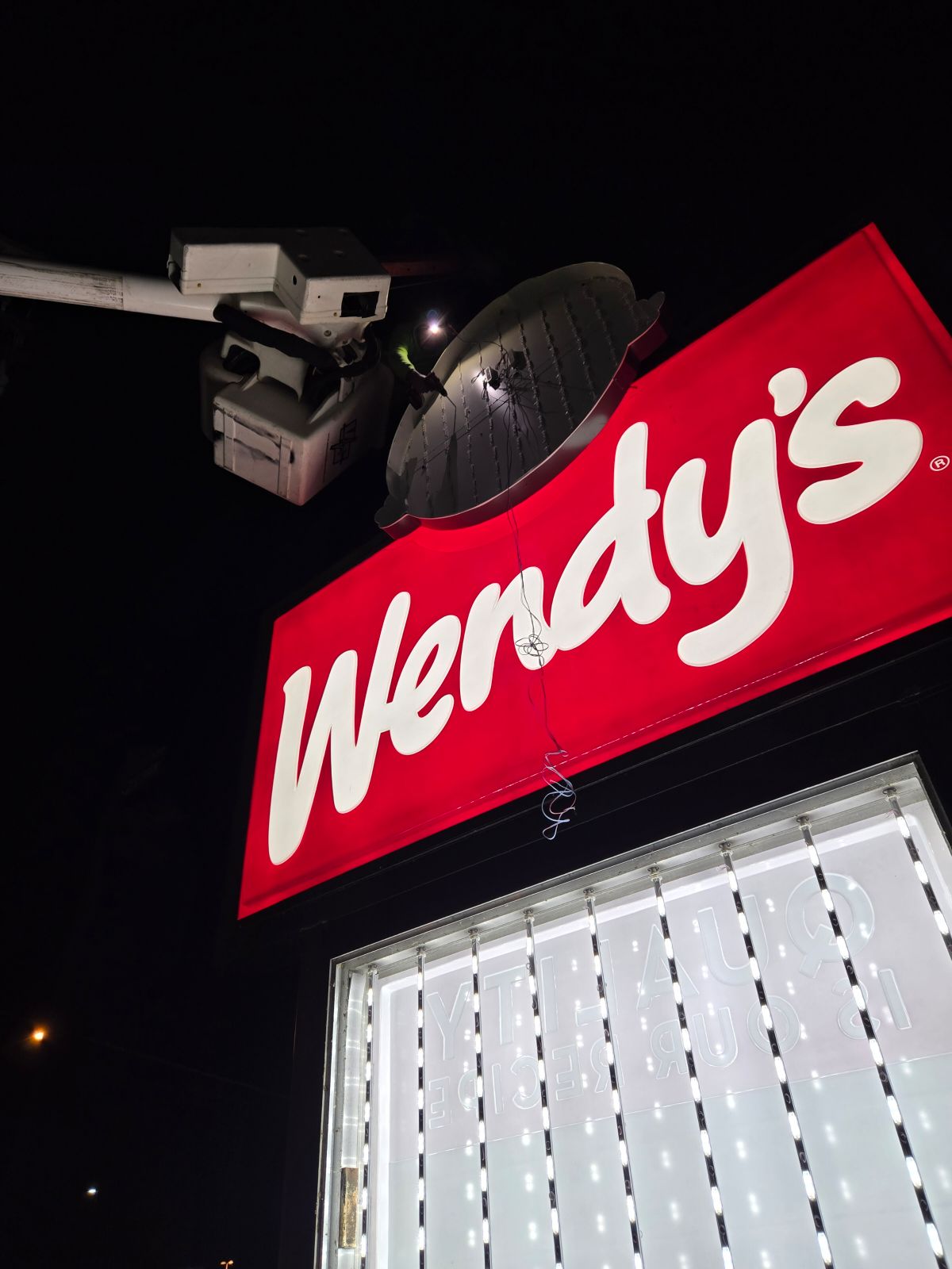
Nothing says "I don't care about the details" quite like a sign with a burnt-out letter or peeling vinyl. In the Capital Region, our signs endure harsh sun, heavy snow, and fluctuating temperatures. Over time, even the best materials can fade or face mechanical issues.
A neglected sign is a major red flag for customers. It suggests that if you can't be bothered to fix your own front door, you might not be bothered to provide high-quality service to them. There's no doubt that a well-maintained sign correlates with a customer's perception of your product quality.
The Fix: Perform a monthly "sign audit." Check for dimming LEDs, peeling edges, or dirt buildup. If your sign is looking a little tired, contact a professional for a refresh. At Vital Sign & Graphics, we pride ourselves on our design-to-installation service, which includes ensuring your sign stays in top shape for years to come.
Why Local Expertise Matters
Choosing the right partner for your signage is just as important as the design itself. National online sign printers don't understand the specific zoning laws in Troy or the wind-load requirements for a pylon sign in Albany. They can't come to your site to measure the viewing angles or ensure the colors match your existing masonry.
At Vital Sign & Graphics, we are your local experts. From the initial concept and design to the final installation and ongoing maintenance, we handle it all under one roof. We understand the Capital Region because we live and work here too. Whether you need high-end digital signs or simple interior signs to guide your customers, we have the tools and the talent to make it happen.
Don't let a simple mistake hold your business back. There's sure to be a solution that fits your budget and your brand's unique personality. You won't be disappointed when you see the difference a professionally designed, correctly installed sign can make for your bottom line.
Ready to give your storefront the upgrade it deserves? Stop blending into the background and start standing out. Whether you’re in Troy, Albany, Schenectady, or Clifton Park, our team is ready to help you create a sign that works as hard as you do.
Contact Vital Sign & Graphics today for a consultation, and let’s turn your storefront into your most effective marketing tool!
Comments